
Let me take you back to a specific afternoon just a few weeks ago. I was sitting at a small, slightly wobbly wooden table at a corner café here in Rio de Janeiro. The late afternoon sun was doing that incredible thing where it hits the cobblestone streets at just the right angle, bathing everything in a warm, cinematic golden glow.
Across the table was a beautifully crafted cappuccino, the steam rising perfectly against the backdrop of a vintage brick wall. It was a moment that demanded to be captured. I pulled out my smartphone, framed the shot carefully, tapped the screen to lock focus, and pressed the shutter.
I looked at the screen, expecting to see magic. Instead, I saw a flat, lifeless image.
The camera’s automatic processing had aggressively tried to “fix” the lighting. It brightened the moody shadows, neutralized that gorgeous golden tint into a sterile white, and over-sharpened the steam until it looked like static noise. The photo wasn’t terrible, but it completely lacked the feeling of being there.
For years, this was my daily struggle with mobile photography. I had a folder on my phone overflowing with almost-great photos that just needed a little push to match reality. And for years, I cycled through every mainstream photo editing application on the market trying to find the perfect solution.
The Problem With Modern Mobile Editors
If you are anything like me, your smartphone’s app library looks like a graveyard of abandoned creative tools.
You probably have one app dedicated to slapping vintage filters onto your photos, another one specifically for blurring backgrounds, and maybe a heavy-duty, professional-grade app that you open once every six months, get immediately overwhelmed by, and close.
I used to think that the more complex an app was, the better my photos would turn out. I would spend twenty minutes staring at a confusing interface with tiny sliders, adjusting the luminance and chromatic aberration, only to end up with an image that looked deep-fried and entirely unnatural.
On the opposite end of the spectrum were the “one-tap” apps. These applications promised instant perfection. You tap a button labeled “Sunset” or “Film 400,” and the app completely overwrites your image’s natural colors. For a while, I loved this. It was easy. But eventually, I realized all my photos looked exactly the same. They didn’t look like my photos anymore; they looked like a trendy Instagram aesthetic from 2018.
I didn’t want to become a professional retoucher, but I also didn’t want my memories to look like they came from a cookie-cutter assembly line. I needed a middle ground. I needed a tool that respected the original capture but gave me the precise, intuitive control to bring the emotion back into the frame.

Enter Darkroom: The Breath of Fresh Air
My frustration reached a tipping point after a weekend getaway. I had taken about two hundred photos, and the thought of individually running them through a clunky editor made me want to delete them all.
That’s when a photographer friend told me to stop overcomplicating my life and download Darkroom.
I’ll admit, I was skeptical. I had read countless reviews and even written my own thoughts previously on The Photography App That Took My Pictures From Good to Amazing, so I felt like I already knew the landscape. I assumed this would be just another generic editor with the same sliders under a different color scheme.
I was wrong. From the very first moment I opened the app, my entire workflow shifted.
The first thing that struck me wasn’t what the app had, but what it didn’t have. There was no “Import” button.
If you’ve used mainstream photo editors, you know the agonizing process of scrolling through your camera roll, selecting a photo, importing it into the app’s separate ecosystem, editing it, exporting it, and then ending up with duplicate files clogging your storage.
Darkroom completely bypasses this. It syncs directly and seamlessly with your phone’s native photo library. When you open the app, your entire camera roll is just… there. Ready to be touched. When you make an edit, it saves seamlessly. You can revert to the original at any time, directly from your phone’s default photo app.
This single feature eliminated so much friction from my day that I instantly felt a wave of relief. It felt less like a separate software program and more like a massive, powerful upgrade to my phone’s default operating system.
The Interface: Designed for Human Hands
Once I got over the joy of the seamless library integration, I started actually editing.
The design philosophy of this app is clearly focused on the mobile experience. Many professional editing apps feel like desktop software that has been awkwardly crammed onto a six-inch touchscreen. Your thumbs cover the sliders you are trying to adjust, and you constantly have to zoom in and out to see what you are doing.
Here, everything is tactile. The sliders are thick and responsive. When you tap and hold on an image, it instantly shows you the “before” state, allowing you to quickly check if you’ve pushed the contrast too far.
But the real magic lies in how the tools are organized. They aren’t hidden behind endless sub-menus. The basic adjustments—brightness, contrast, highlights, shadows, saturation, and vibrance—are grouped together intuitively.
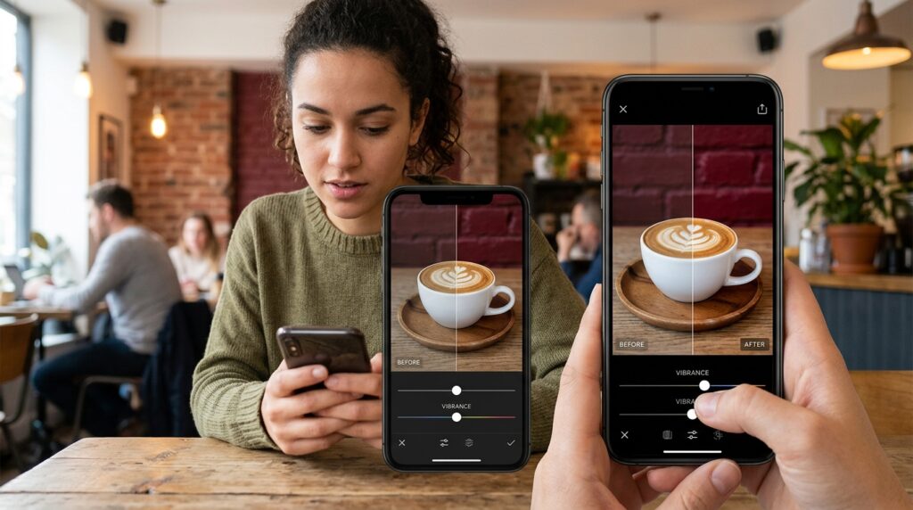
Let’s talk about the difference between saturation and vibrance for a second, because this app handles it beautifully. When I try to make a sky bluer using a standard saturation slider, it often turns people’s skin bright orange. It’s a rookie mistake, but a common one. Vibrance, on the other hand, is smarter. It boosts the muted colors in an image while leaving the already well-saturated colors (like skin tones) alone.
Using this app’s vibrance tool on that café cappuccino photo I mentioned earlier was a revelation. It brought back the deep reds of the brick wall and the rich brown of the coffee without making the white porcelain cup look unnatural.
Mastering the Curves Tool (Without the Headache)
If there is one feature that separates amateur mobile edits from professional-looking mobile photography, it is the Curves tool.
I used to be terrified of the Curves tool. It looked like a mathematical graph, and every time I tried to use it in other apps, I ended up ruining my photo. But I’ve spent a lot of time recently researching Hidden Editing Features in Photo Apps That Improve Photos Instantly, and I realized that mastering Curves is the absolute key to achieving that rich, film-like aesthetic everyone loves.
Darkroom makes the Curves tool incredibly approachable. Instead of just giving you a blank line to drag around blindly, it subtly visually guides you.
I quickly learned the secret to the “fade” look. By simply grabbing the very bottom left point of the curve (the pure blacks) and dragging it slightly straight up, the darkest parts of the image become a soft, milky dark gray instead of a harsh, crushing black. Then, by pulling the middle of the curve down just a fraction, the mid-tones become richer.
In about fifteen seconds, without using a single pre-made filter, I had transformed a harsh digital snapshot into a moody, cinematic photograph. It felt like I had finally unlocked the secret language of photography right from my couch.
The Game-Changer: Batch Editing
Remember that weekend getaway with the two hundred photos I mentioned earlier? This is where this app truly secured its permanent spot on my home screen.
Let’s say you take a series of twenty photos at the beach. The lighting is exactly the same in all of them. In the past, I would edit the first photo, try to remember exactly where I put all the sliders, and then manually repeat the process for the next nineteen photos. It was tedious, soul-crushing work.
With my new workflow, I spend five minutes perfecting the edit on the first beach photo. I get the blues of the ocean popping and the highlights of the sand just right.
Then, I tap “Copy Edits.” I select the other nineteen photos in the grid view, and I tap “Paste.”
In less than two seconds, the app applies that exact custom color grade to every single photo simultaneously. I can then quickly swipe through them, making tiny micro-adjustments if one photo is slightly darker than the rest, but the heavy lifting is completely done.
This batch processing feature alone saves me hours of time every single month. It allows me to maintain a cohesive visual style across a whole set of memories without feeling like I’m clocking into a part-time job.
Protecting the Final Product
Of course, once I have these beautifully edited, high-resolution images, my next priority shifts from aesthetics to security. Losing digital memories is a modern tragedy I actively try to avoid.
Because this app uses non-destructive editing directly synced with my phone’s library, I don’t have to worry about manually backing up “edited” versions versus “original” versions. However, ensuring the whole ecosystem is safe is paramount.
Once I finish a major editing session—say, from a vacation or a family event—I always ensure my backups are running properly. I’ve actually tested and compiled my favorite solutions for this, which you can read about in my guide to 12 Photo Storage Apps That Keep My Memories Safe. Knowing that my perfectly color-graded memories are securely archived off-device gives me immense peace of mind.
Why It Finally Clicked
Finding the right mobile app isn’t just about the spec sheet. It’s about how the software makes you feel when you use it.
The previous apps I relied on made me feel inadequate. They made me feel like I didn’t know enough about color science or pixel density to produce a good image. They threw up barriers between my creativity and the final product.
This app does the exact opposite. It empowers me. It takes complex photographic principles and presents them in a way that feels playful and intuitive.
I no longer dread opening my camera roll after a day out. I actually look forward to it. I pour myself a cup of coffee, sink into my couch, and spend twenty minutes relaxing while I bring my favorite moments to life. Editing is no longer a chore; it has become a genuinely mindful, creative extension of the photography process itself.

Final Thoughts
We live our lives through our smartphones. The cameras in our pockets are better than the professional equipment from a decade ago. But capturing the light is only half the battle. Processing that light, shaping it, and molding it to reflect how a moment truly felt—that is where the magic happens.
If you are tired of fake-looking filters, if you are exhausted by confusing interfaces, and if you simply want your photos to look like the best possible version of reality, I cannot recommend rethinking your editing workflow enough.
Take a step away from the automated algorithms. Give yourself the breathing room to actually play with the lighting, shadows, and colors of your own life. You might just discover, like I did, that you are a much better photographer than you ever realized. All you needed was the right tool to help you see it.
